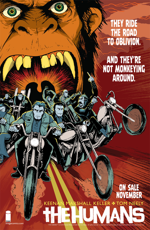
 Here’s a comic book page advertisement I made for THE HUMANS.
Using the cover to issue one, I zoomed in on the art and moved it off-center to create some negative space for the text. A font was selected that resembled text from the book to keep everything looking thematically consistent. Some of the art in the background was slightly altered to allow the text to be read easier.
==========================================
[6.5″x10″] InDesign (layout and text)
