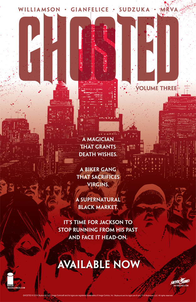
 Here’s a comic book page advertisement I made for GHOSTED VOL 3.
I didn’t want to use the same exact setup as the cover to the tradepaperback, but I did want to keep the negative space for text. So I played up the red theme color with an overlay over the entire image and added in the sales text in white to stand out from the background.
==========================================
[6.5″x10″] InDesign (layout and text)
