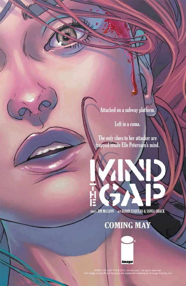
 Here’s a comic book page advertisement I made for MIND THE GAP.
This was another ad I had a lot of fun making. Because the tagline calls attention to Elle’s attack and the clues trapped insider her mind, I cropped and zoomed-in on the art to focus on her face. I wanted to make certain the viewer saw the trauma of the attack on her head as well as somewhat feeling haunted by her stare. I desaturated the colors some to give it a colder sense. I also angled the art to give an unbalanced, unsettling feel, like you’re looking at her moments after the attack.
I kept the text all white to contrast with the dark colors of the art. I also kept all the text vertical in a line that begins with the blood running down Elle’s head. Thus, whenever the viewer looks at the blood, the viewer’s eye is naturally led back to the tagline and sales solicit info.
==========================================
[6.5″x10″] Photoshop (image edits) -> InDesign (layout and text)
