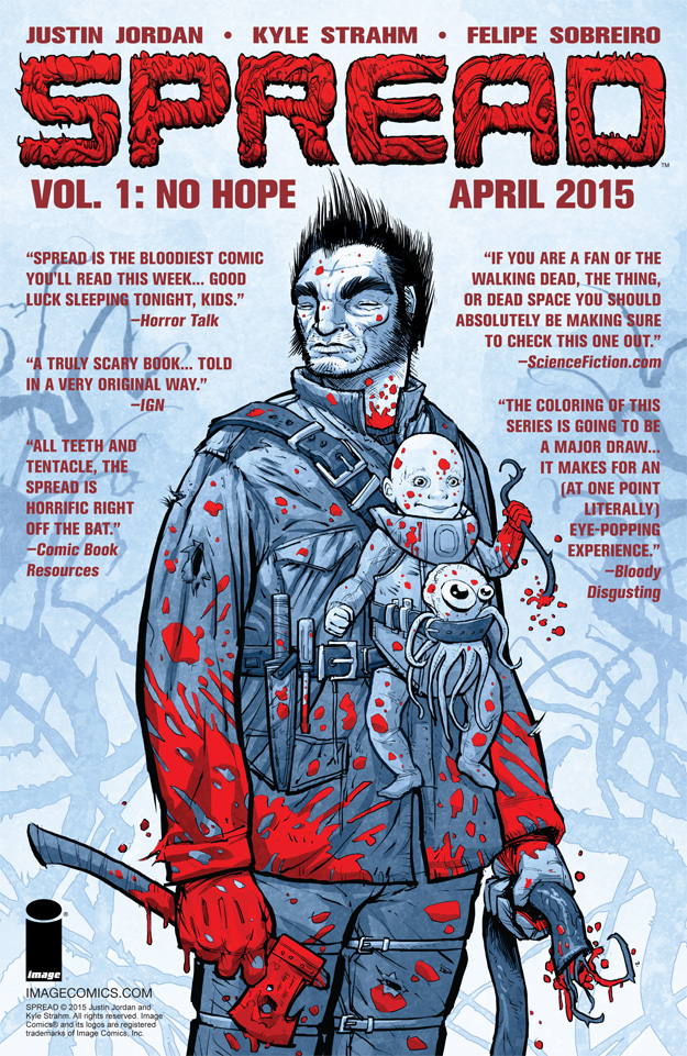
 Here’s a comic book page advertisement I made for SPREAD VOL 1.
The cover image itself was already pretty striking and had plenty of negative space for text, so I pretty much left the image as is. I placed all the quotes and book info in a dark red so the elements in brighter red standout first. The quotes in red helps separate from the blue background and keeps everything within the red/blue color scheme.
==========================================
[6.5″x10″] InDesign (layout and text)
